Vortex
ENGINEERING IN MOTION
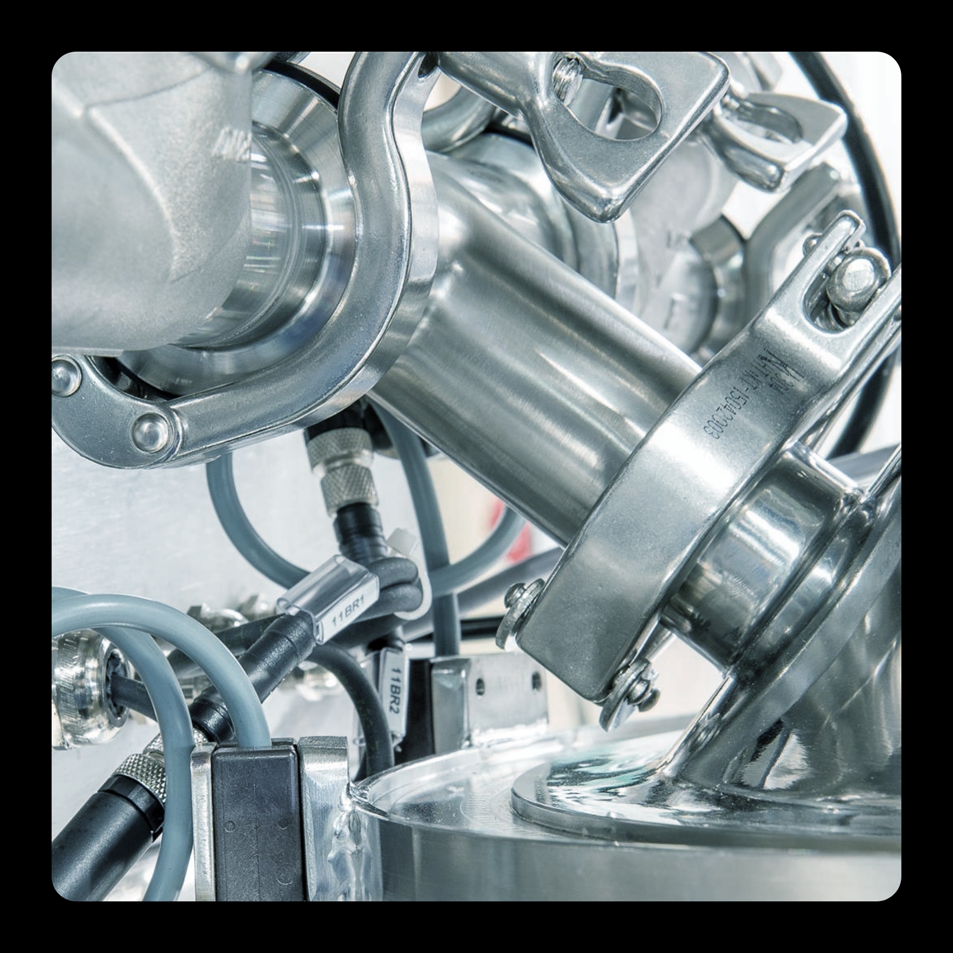
Vortex designs and manufactures tailor-made industrial equipment where precision, movement and technical expertise come together. We reshaped the brand around these very principles : building a bold visual identity and digital experience that turn industrial complexity into something clear, distinctive and dynamic.
© Photos — Vortex
THE NAME TAKES SHAPE
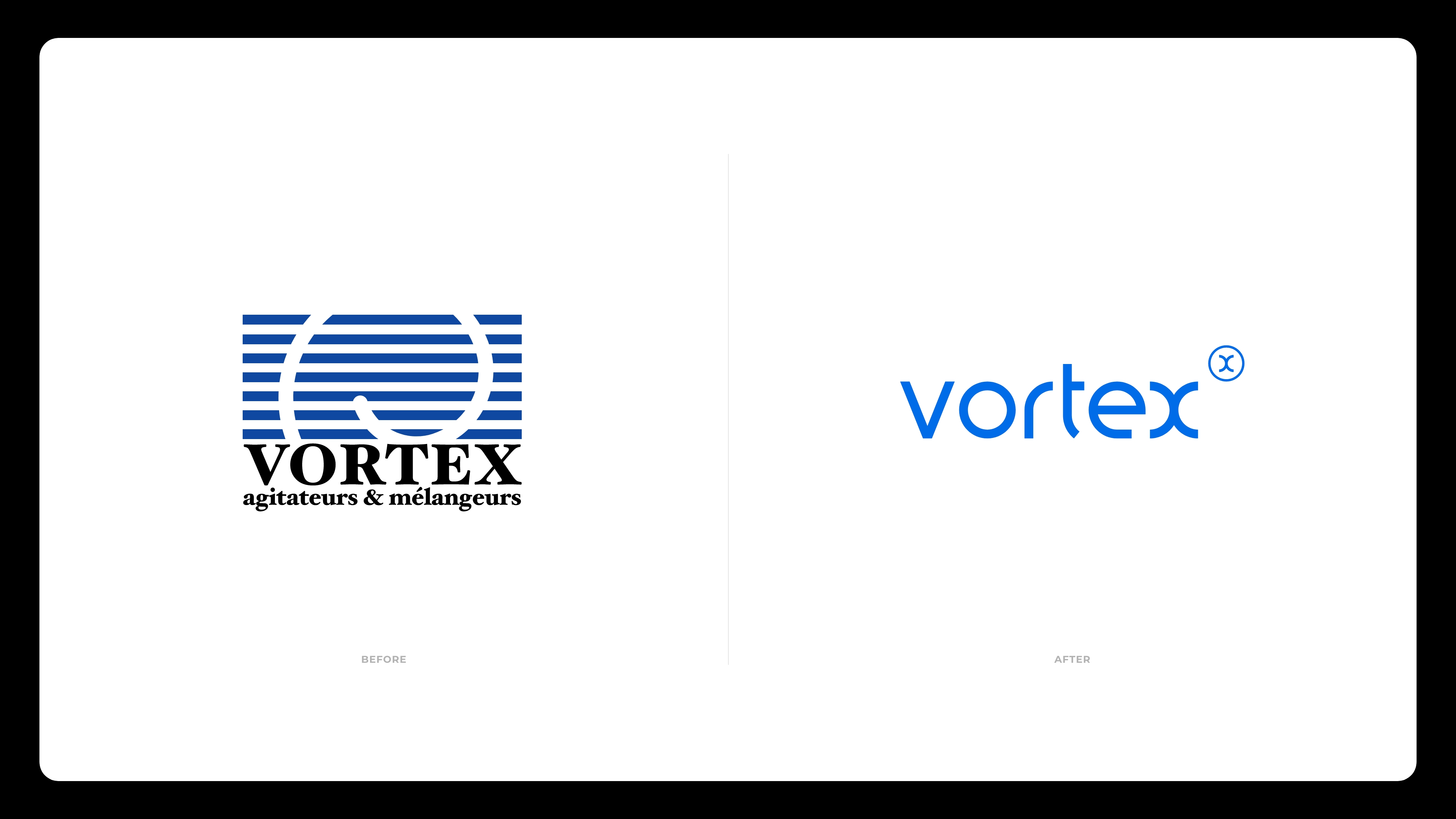
We brought Vortex’s name and symbol into a single, distinctive gesture. Built around curves and continuous movement, the new wordmark reflects the dynamics at the heart of the brand. Its defining “x” echoes the shape of a vortex, embedding the idea of motion directly into the identity.

MAKING THE BRAND MOVE
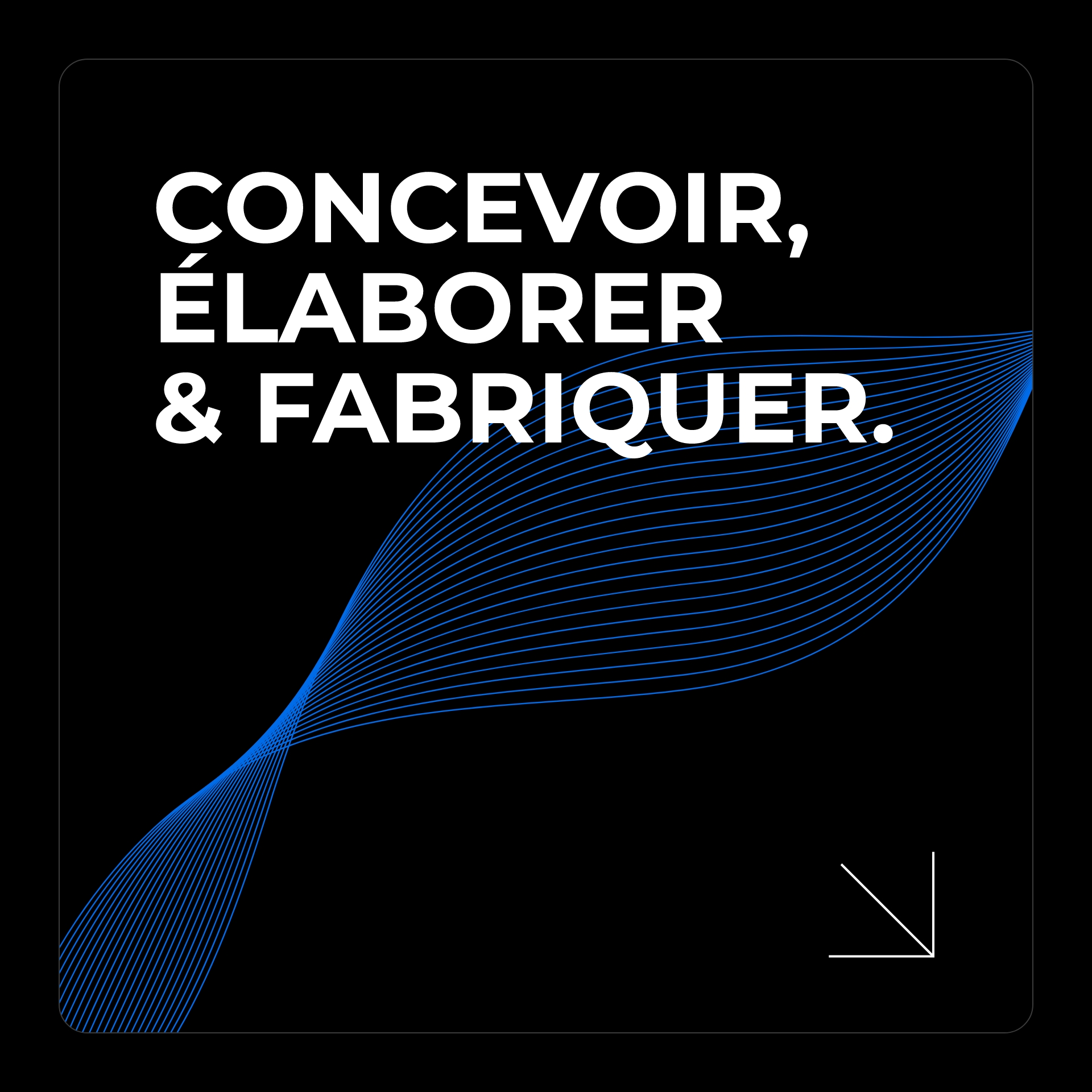
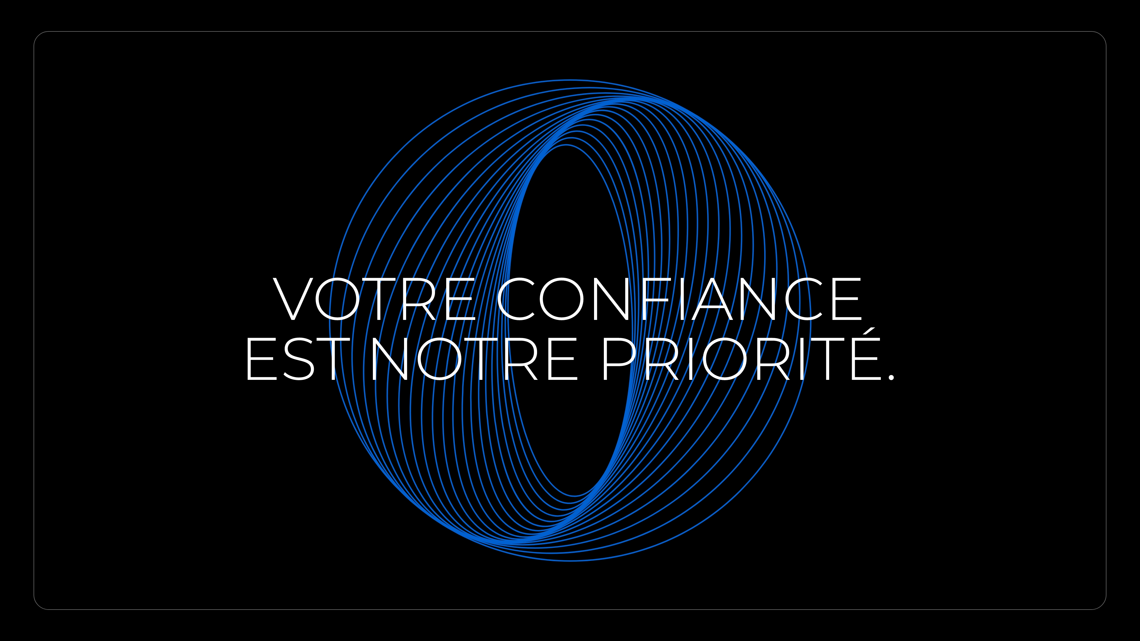
The new identity extends far beyond the logo. Inspired by the movement of fluids at the heart of Vortex’s expertise, we developed a graphic system built around flow, rotation and transformation. Custom graphic elements, typography, iconography and motion come together to create a flexible visual language — one that makes movement an integral part of the brand.
FROM IDENTITY
TO EXPERIENCE
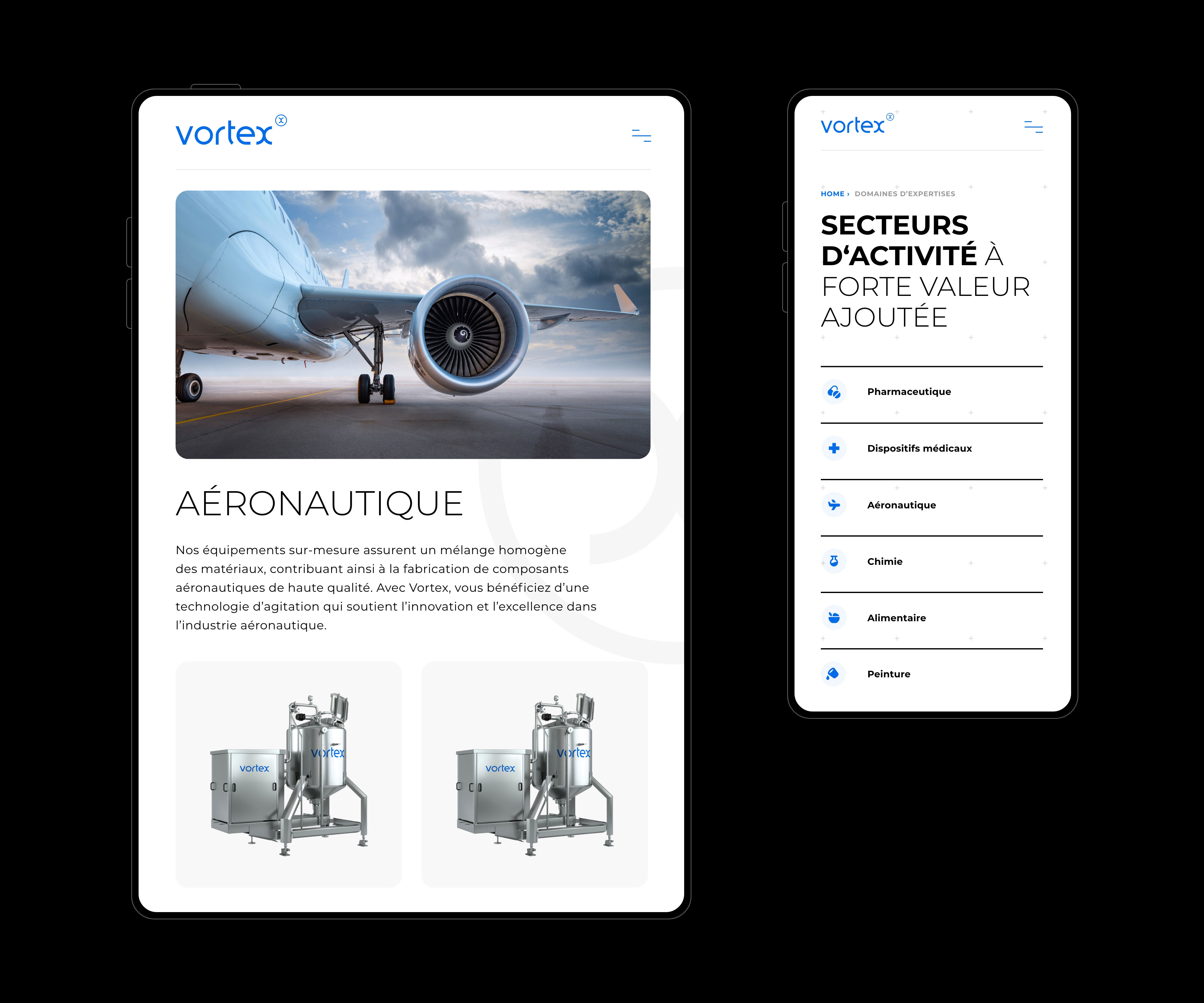
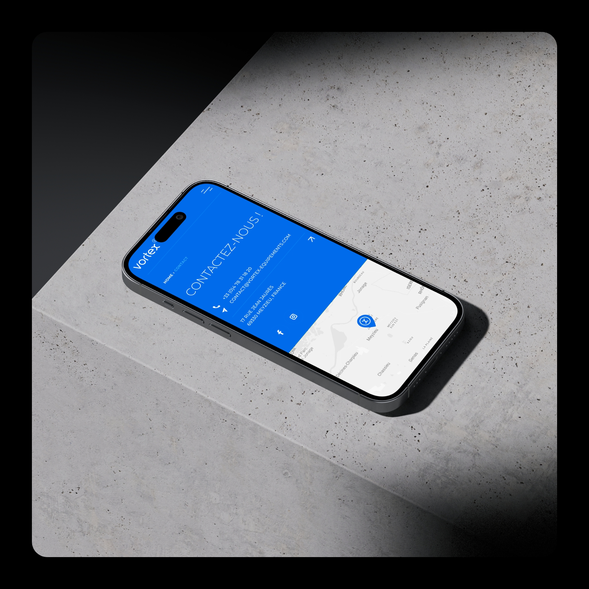
We translated the identity into a complete digital experience, designed to make Vortex’s technical expertise clear and accessible. From navigation to responsive layouts, every component was built to organise complex information without losing the energy of the brand. The result is a flexible platform where content, functionality and visual identity move as one.